Submodule 4.1: Navigation - Icons
| Site: | ΕΛ/ΛΑΚ Moodle |
| Course: | Study / Web Design and Web Development |
| Book: | Submodule 4.1: Navigation - Icons |
| Printed by: | Guest user |
| Date: | Sunday, 7 June 2026, 8:53 AM |
Description
- Navigation
- Navigation bars
- Breadcrumbs
- Font Awesome
Why Website Navigation?
Why Website Navigation?
- Websites are rarely single pages
- Need to provide visitors an intuitive means of getting around your website
- Several commonly used navigation patterns used on websites
Navigation Bars
- Users often expect it at the top of the website
- Contains links to various pages within your website

Breadcrumbs
- Secondary navigation
- Usually placed below the primary navigation and above the content
- Indicator of the current page’s location within a navigational hierarchy
- Path based: set of steps
- Location based: hierarchy

Create a basic navigation bar
We will now add a simple navigation bar to the web page so that it provides links to the other pages on the website.
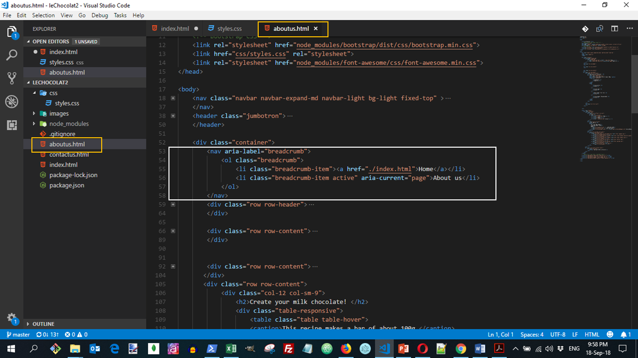
Open the folder "lechocolat" in your code editor and then the "index.html" file. Add the following code to the body just above the header jumbotron.
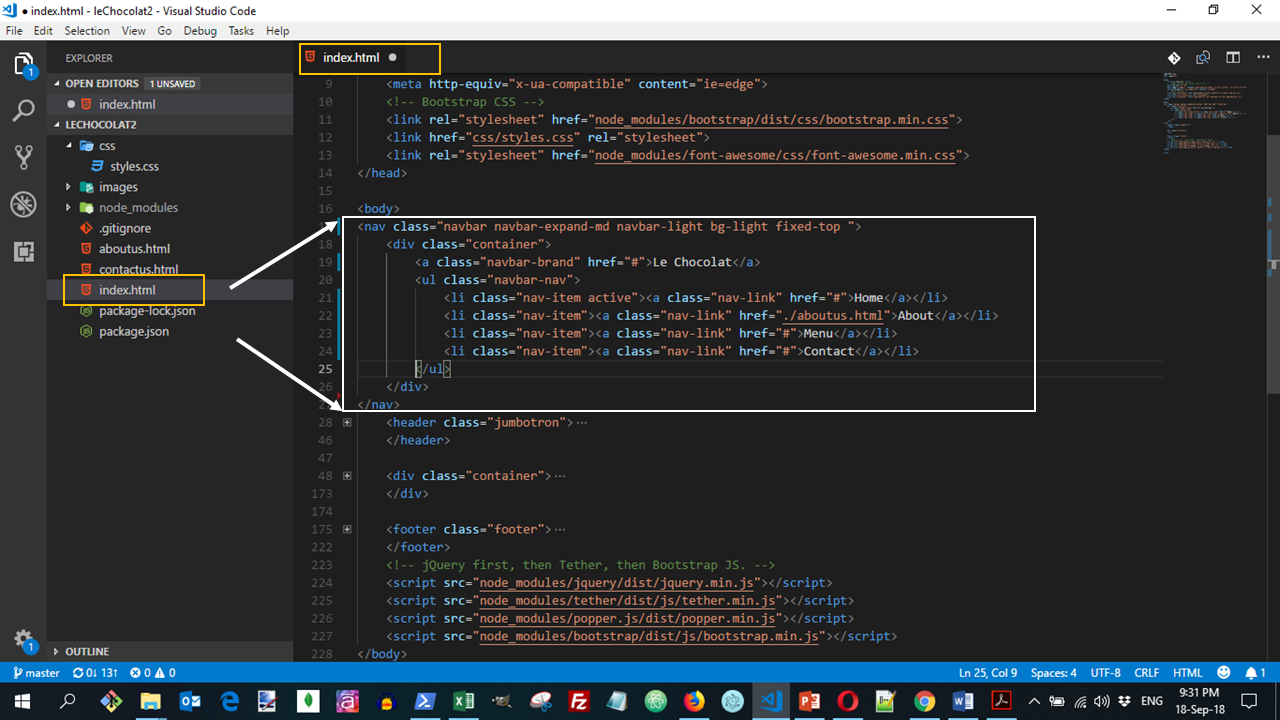
In the above code, we can see the use of the nav element to specify the navigation information for the website. This nav element is styled by the navbar that declares it as a navigation bar, and the navbar-light class to specify that the page should use the light navigation bar.
You will now notice the addition of a link with the name of the Le Chocolat. This is the brand name for the website. You can replace this with the logo for the website. This is created by the <a class="navbar-brand"> tag.
In addition the inner ul is used to specify the items to be put in the navigation bar. This ul is styled with navbar-nav class to specify that the items should be displayed inline inside the navigation bar.
We also use the container class inside the navigation bar.
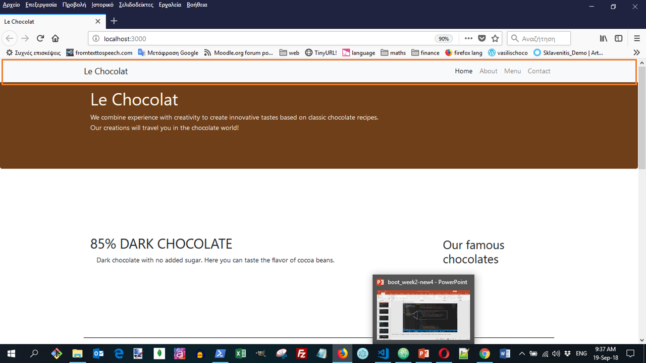
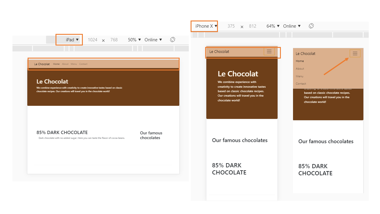
The above code will create a page displayed as:
Creating a responsive navigation bar
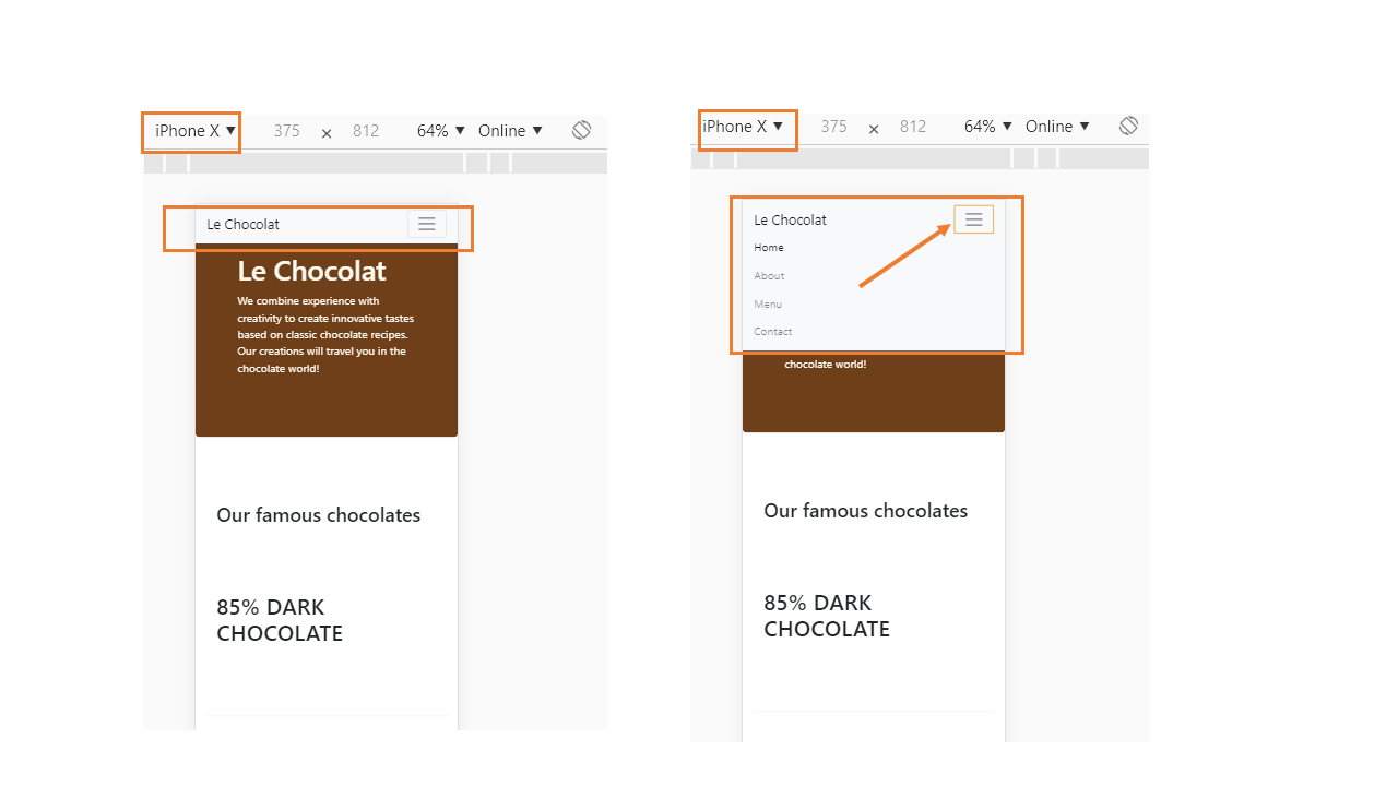
We would like the navigation bar elements to collapse for shorter screens, to be replaced by a toggle button so that the items can be toggled on or off when required on small and extra small screens.
This can be achieved by adding the following code to the navigation bar, inside the container div just below the <a>...</a> tag and above the ul.
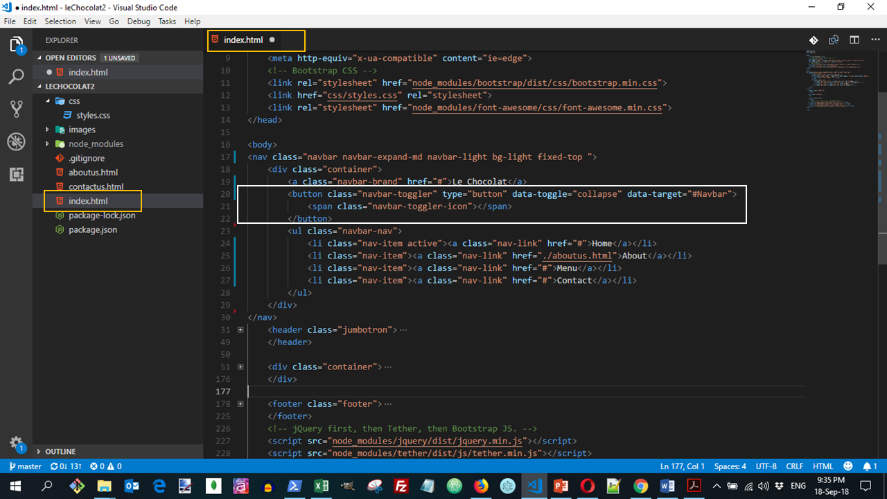
This creates a button with three horizontal lines. For medium to extra large screens, this button is hidden. For small and extra small screens, this button becomes visible. This button will act as the toggle for the navbar items.
To hide the items from the navigation bar for the small screens, we need to enclose the ul within another div as follows:
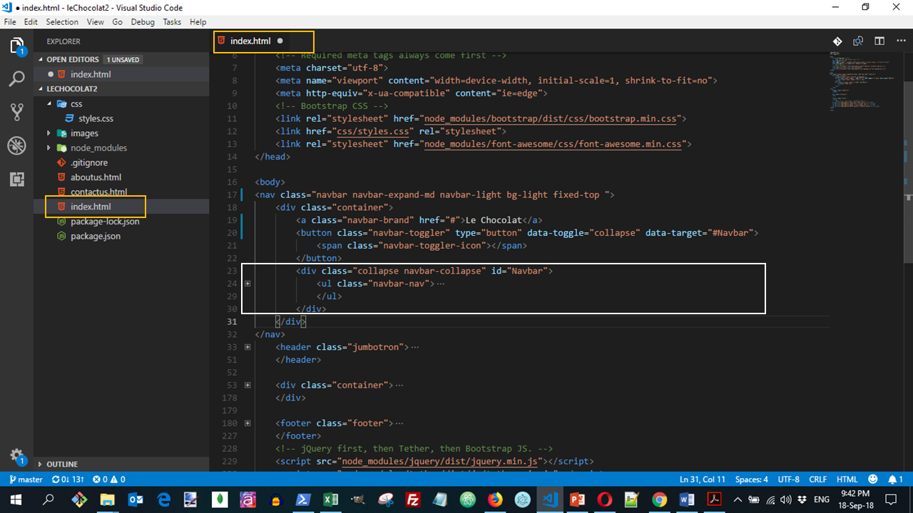
By doing this, we are specifying that this div with collapse and navbar-collapse classes and with the id Navbar will be collapsed on small and xs screens, but can be toggled on or off when the toggle button is clicked.
Note the use of
data-toggle="collapse" data-target="#Navbar"within the button above. This specifies that the menu items are collapsed on small and xs screens when the toggle button is visible. They can be displayed or hidden by clicking the toggle button.
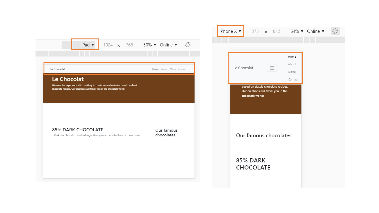
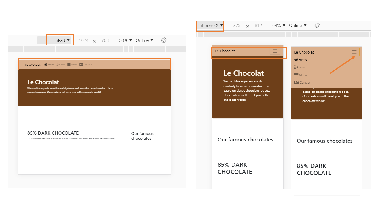
The above code will create a page displayed as:
You can see all the needed code for this lesson:
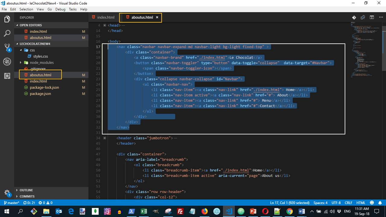
Copy and paste the entire navbar code also into aboutus.html to add the navigation also to that page.
- Make sure to change the <li> corresponding to "About" to active, and remove the active class from the Home link.
- Also, update the home link to take you back to index.html.
- Update the navbar-brand tag also to take you back to index.html.
See more about navigation Bars in Bootstrap
Modifications to the CSS styles
When we use the fixed navigation bar, we should give the body of the page an upper margin of 50px, so that the top 50px of the page does not get hidden under the navigation bar. We also add z-index:0 to be sure that the navigation bar will always be in front of the body.
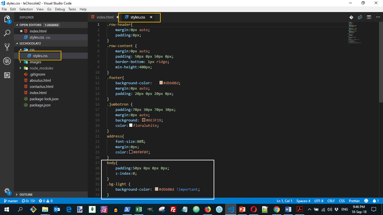
Suppose that we want to change the background color of the navbar. This is the bg-light class. We open the node_modules\bootstrap\dist\css\bootstrap.css and we search the class.

We copy this code and paste it into our css\styles.css file. So we can change the color.
The above code will create a page displayed as:
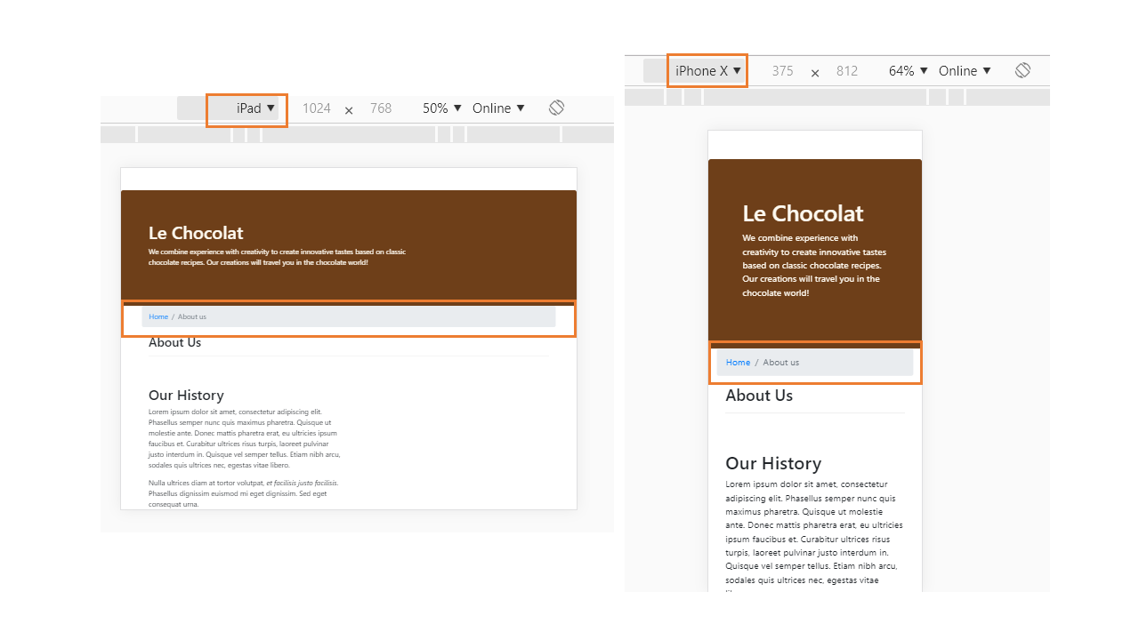
Adding Breadcrumbs
To add breadcrumbs to our pages, we take the help of the breadcrumb and breadcrumb-item classes to add the following above the row containing the About Us title and above this title in aboutus.html.
The above code will create a page displayed as:
Commit
Commit to your Git repository with a message "Navbar and Breadcrumbs".
Icon Fonts
- Set of symbols and glyphs
- Can be used just like regular fonts
- Can be styled with CSS just like regular fonts
- Popular lightweight replacement for simple graphics on the website
- Many icon font packs available
One of the most popular icon font toolkit is Font Awesome. Go to its website http://fontawesome.io/ to check out more details about this icon font.
Adding Font Awesome
Open (a new if needed) terminal, and go to your Bootstrap project folder.
You can get Font Awesome using npm by typing the following at the prompt:
npm install font-awesome --saveWe now need to include the CSS files for font awesome and bootstrap-social in the index.html file. Add the following code to the head:
<link rel="stylesheet" href="node_modules/font-awesome/css/font-awesome.min.css">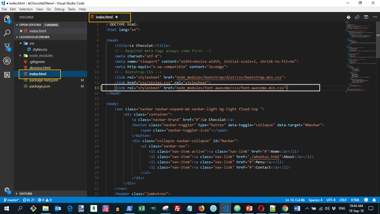
Let us now use some font icons in our web page and decorate it. Update the navbar's ul list items as follows in index.html
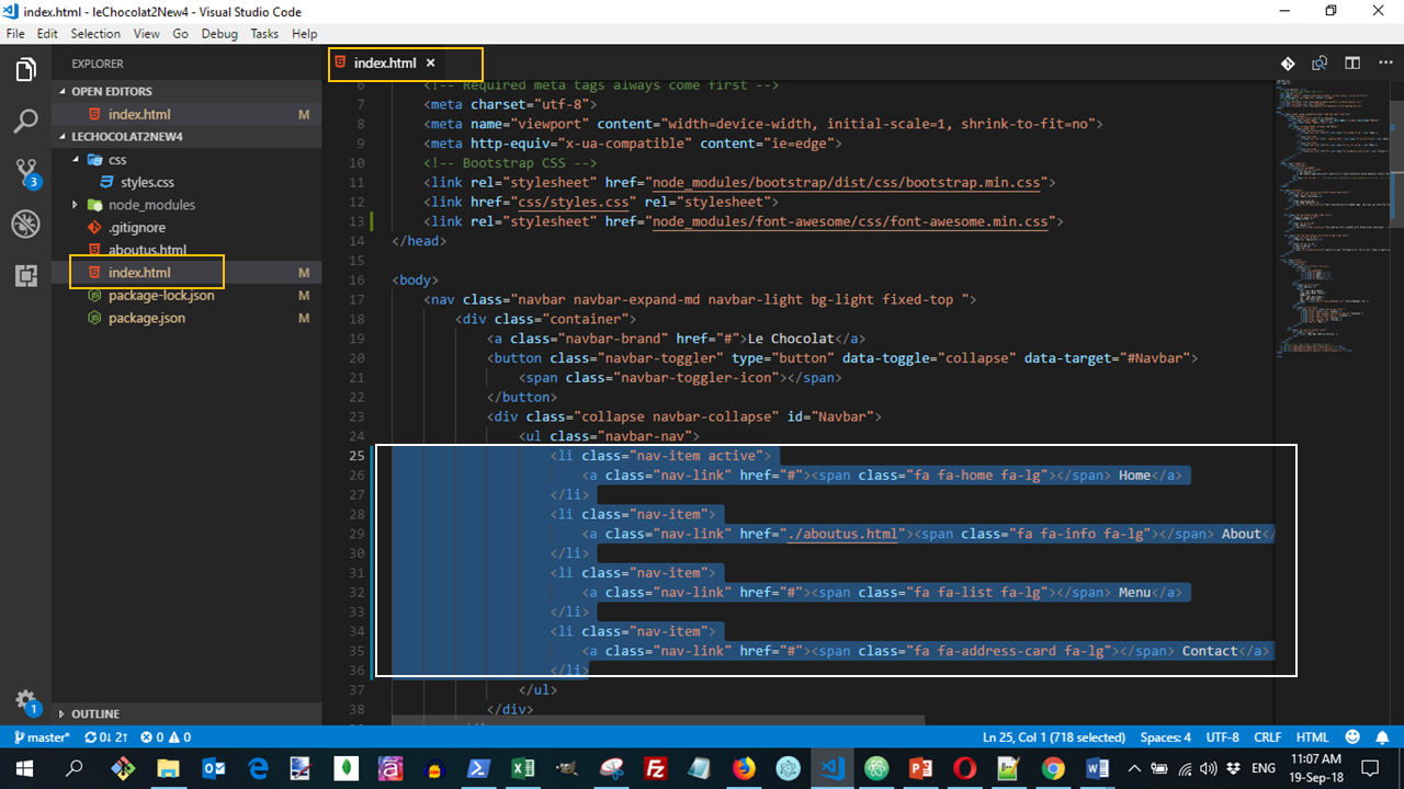
The above code will create a page displayed as:
Similarly, include the CSS files for font awesome and update the navbar's ul list items as follows in aboutus.html:

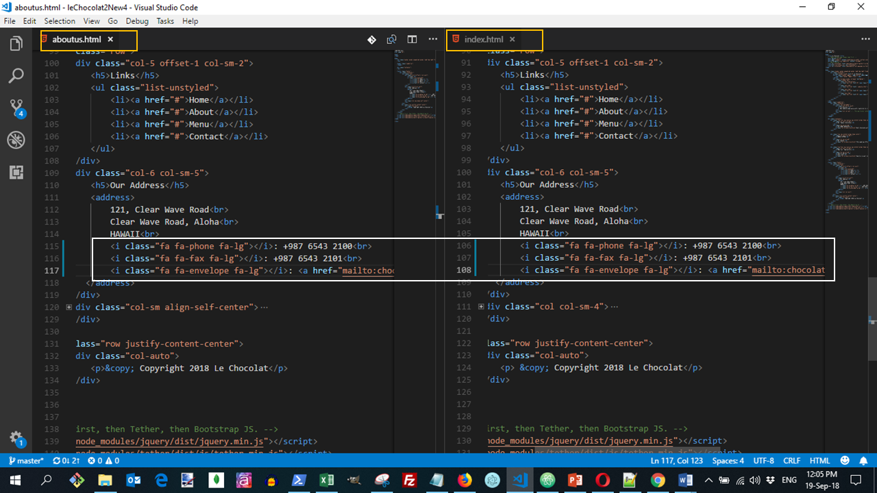
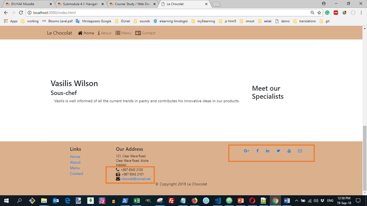
Next, in both index.html and aboutus.html, go down to the address in the footer of the page and replace the "Tel.", "Fax" and "Email" with the corresponding font awesome based icons as follows:
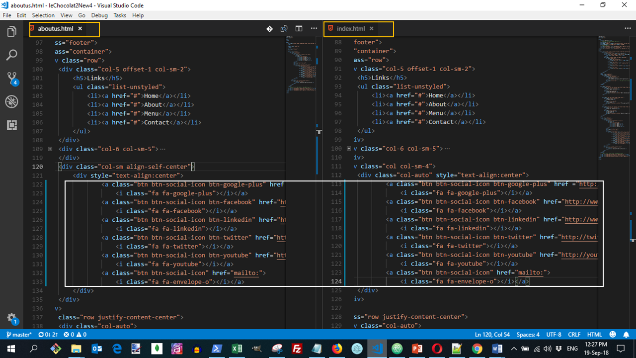
Finally, let us use the bootstrap-social CSS classes to create the social buttons in the footer in both index.html and aboutus.html, by replacing the social sites' links with the following code:
The above code will create a page displayed as:
Save all the changes and commit to your Git repository with the message "Icon Fonts".
Further readings
Official Resources
Other resources
-
- Designing A Winning Navigation Menu: Ideas and Inspirations (Good suggestions on how to design navigation for a website)
- Breadcrumb Navigation: A Guide On Types, Benefits And Best Practices (Great resource on types and usage of breadcrumbs)
- Bootstrap social: Social Sign-In Buttons made in pure CSS based on Bootstrap and Font Awesome!