Submodule 10.1: Tabs and Tabbed Navigation
| Site: | ΕΛ/ΛΑΚ Moodle |
| Course: | Study / Web Design and Web Development |
| Book: | Submodule 10.1: Tabs and Tabbed Navigation |
| Printed by: | Guest user |
| Date: | Friday, 26 June 2026, 1:48 AM |
Description
- Tab Navigation Elements
- Tab Content
- Tab-content CSS
Introduction
In this submodule, we examine tabs and tabbed navigation. Tabs require Javascript support to be enabled for navigating the content.
We will:
- Design a web page to use tabbed navigation for organizing the content
- Use tab panes and organize the content into the panes
- Facilitate navigation among the tab panes using the tabbed navigation elements
See more about tabbed navigation
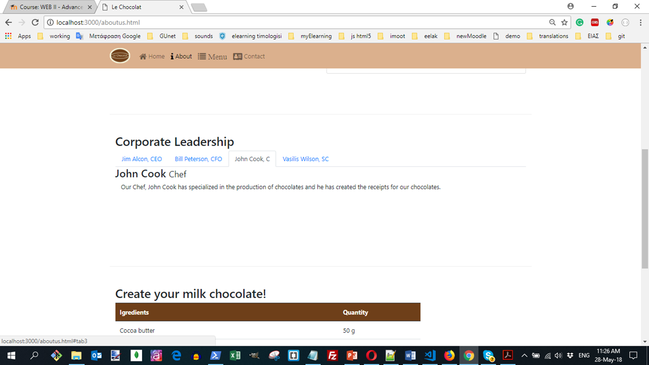
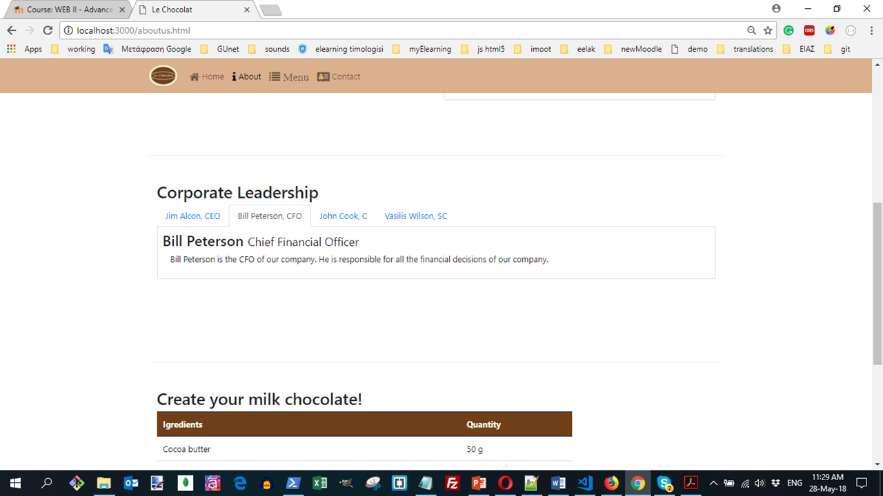
Adding Tab Navigation Elements
Open the aboutus.html page and move to the second content row containing the details of the corporate leadership of the restaurant.
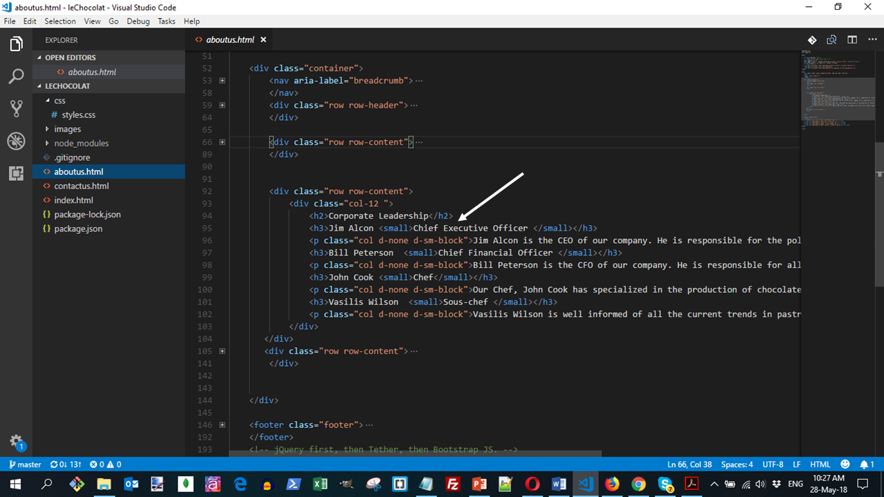
Right after the Corporate Leadership heading, introduce the following code to set up the tabbed navigation:
Note the use of the <ul> tag with the nav and nav-tabs classesto set up the tab navigation.
Each list item within the list acts as the tab element. Within each list item, note that we set up the <a> tags with the href pointing to the id of the tab pane of content to be introduced later.
Also note that the <a> tag contains the data-toggle=tab attribute. The first list element's <a> tag contains the class active. This tab will be the open tab when we view the web page.
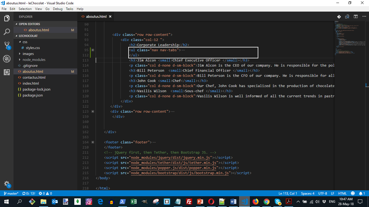
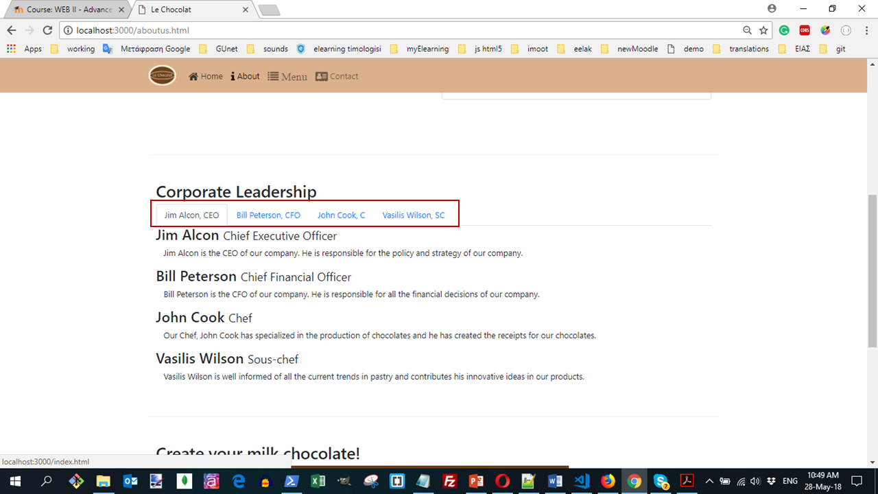
We can switch to the other tabs using the tabbed navigation that we just set up.
Adding Tab Content
The details about the various corporate leaders should now be organized into various tab panes. To begin this, we will enclose the entire content into a div element with the class tab-content as specified below:
<div class="tab-content">
  ...
</div>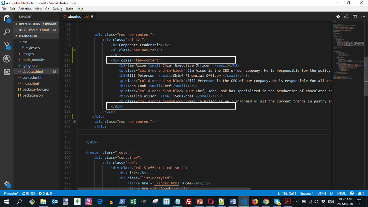
Then we take the name and description of the CEO of the company and enclose it within a tab-pane as follows:
<div role="tabpanel" class="tab-pane fade show active" id="tab1">
  <h3> ... </h3>
  <p> ... </p>
</div>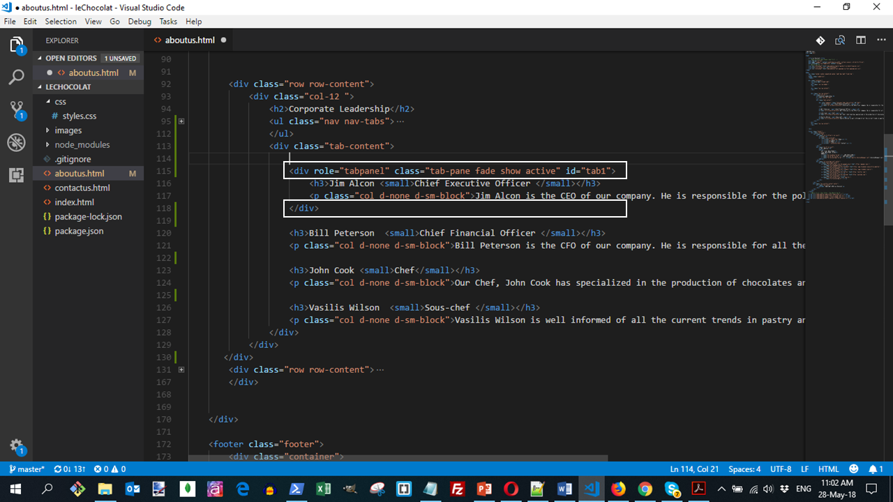
Note the use of the tab-pane, fade, show, and active classes and with tab1 as the id. This is the same id used as the href in the <a> link in the navigation.
The remaining content is also similarly enclosed inside appropriate divs with the correct ids and the classes specified as above. Only the first tab pane will have the show and active classes specified to indicate that the content should be visible on the web page by default.
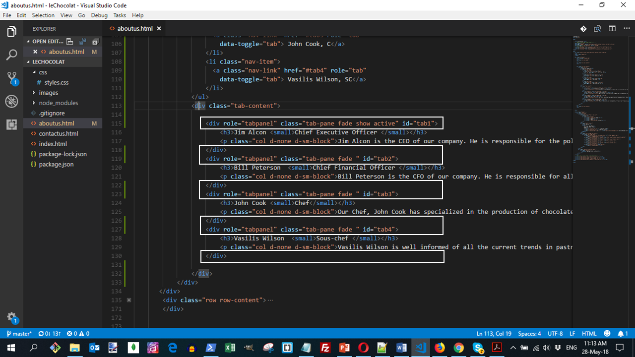
The HTML view is:
Modifying the tab-content CSS
We now modify the CSS styles for the tab-content class in the mystyles.css file as follows:
.tab-content {
  border-left: 1px solid #ddd;
  border-right: 1px solid #ddd;
  border-bottom: 1px solid #ddd;
  padding: 10px;
}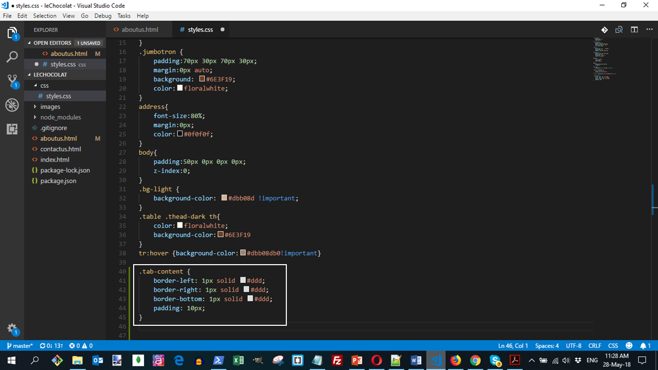
This modification adds a 1px border to the tab content which joins with the upper border introduced by the tab navigation element to give a clean tab like appearance.
Do a Git commit
Do a Git commit with the message "Tabs".
In this submodule, we learnt the use of tabbed navigation, tab content and tab panes and their use in organizing and navigating within the content in a page.