Submodule 10.2: Accordion
| Site: | ΕΛ/ΛΑΚ Moodle |
| Course: | Study / Web Design and Web Development |
| Book: | Submodule 10.2: Accordion |
| Printed by: | Guest user |
| Date: | Thursday, 16 July 2026, 10:04 PM |
Description
- Collapse plugin
- Cards
- Accordion
Introduction
In this submodule we examine the collapse javascript plugin that allows us to hide and reveal content. In particular, we explore its use in creating an accordion.
We will use the collapse Javascript plugin together with card component to create an accordion to show/hide content in a web page.
See more about Accordion
Converting Tabs to Accordion
Open the aboutus.html page and move to the second content row containing the details of the corporate leadership of the restaurant.
First delete the <ul> class that was introduced for the tabbed navigation.
Then turn the tab-content div into a accordion div. Use the code structure as shown below:
<div id="accordion" >
 . . .
</div>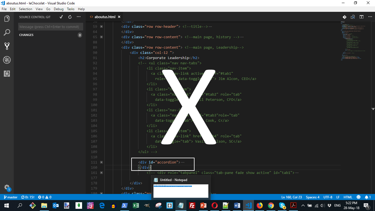
Then, convert the first tab-pane into a card such that the name appears as a card heading, and the <p> will be in the card body. Use the structure of the code as shown below:
<div class="card">
  <div class="card-header" id="headingOne">
     <button class="btn btn-link" data-toggle="collapse" data-target="#collapseOne" aria-expanded="true" aria-controls="collapseOne">
       <h4>Jim Alcon <small>Chief Executive Officer </small></h4>
     </button>
   </div>
   <div id="collapseOne" class="collapse show" aria-labelledby="headingOne" data-parent="#accordion">
     <div class="card-body">
       <p class="col d-none d-sm-block">Jim Alcon is the CEO of our company. He is responsible for the policy and strategy of our company. </p>
     </div>
  </div>
 </div>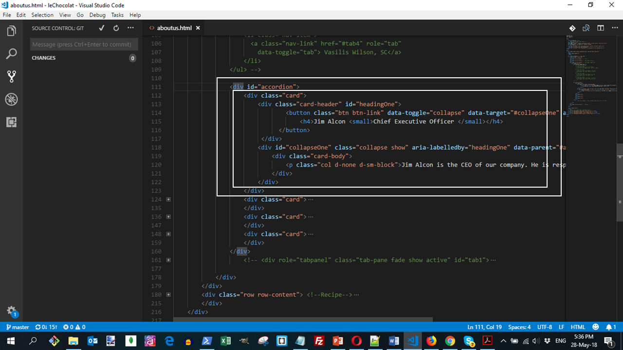
For the next leader, use the next structure, with the appropriate ids set up for the cards, as shown in the code structure below:
<div class="card">
  <div class="card-header" id="headingTwo">
     <button class="btn btn-link collapsed" data-toggle="collapse" data-target="#collapseTwo" aria-expanded="false" aria-controls="collapseTwo">
       <h4>Bill Peterson <small>Chief Financial Officer </small></h4>
     </button>
   </div>
   <div id="collapseTwo" class="collapse" aria-labelledby="headingTwo" data-parent="#accordion">
     <div class="card-body">
       <p class="col d-none d-sm-block">Bill Peterson is the CFO of our company. He is responsible for all the financial decisions of our company. </p>
     </div>
   </div>
 </div>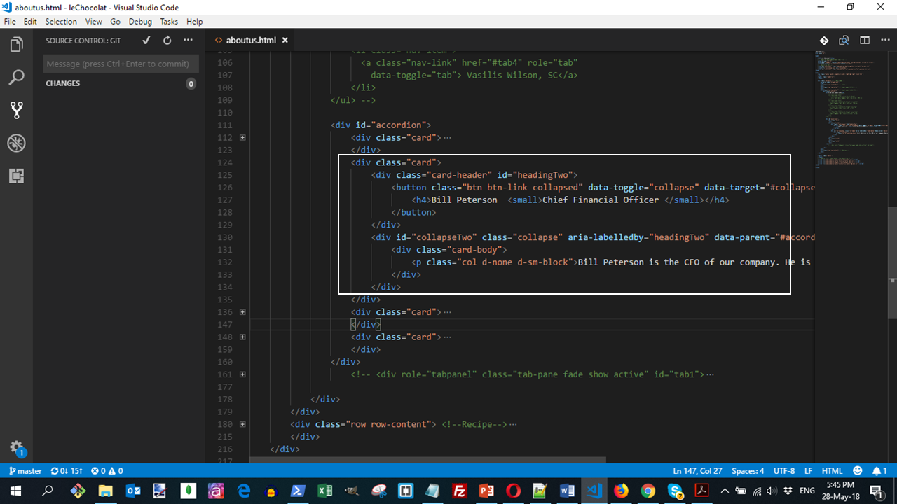
For the remaining three leaders, use the same structure as above, with the appropriate ids set up for the cards:
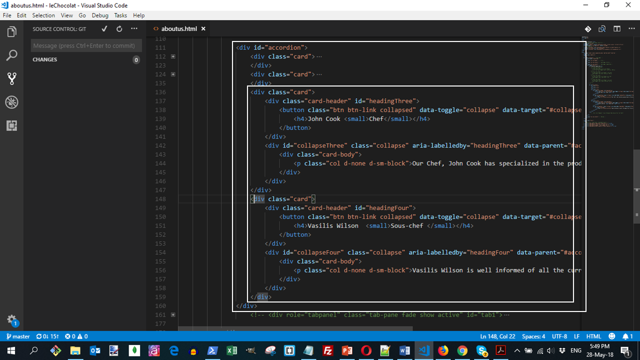
You can alternatively copy and paste all the accordion code
Do a Git commit
Do a Git commit with the message "Accordion".
In this submodule we constructed the accordion using the collapse plugin together with the card component.