Submodule 10.3: Revealing Content
| Site: | ΕΛ/ΛΑΚ Moodle |
| Course: | Study / Web Design and Web Development |
| Book: | Submodule 10.3: Revealing Content |
| Printed by: | Guest user |
| Date: | Sunday, 28 June 2026, 12:24 PM |
Description
- Tooltip
- Modal
Introduction
In this submodule we look at several ways of presenting information to users by overlaying the information on top of the page. In particular, we look at:
- Tooltips to be displayed when the user hovers over an area of the page
- Popovers when the user clicks on a link or button
- Reveal and hide modals when the user clicks on a link or button
See more for tooltips
See more for popovers
See more for modals
Adding a Tooltip
Let us now switch to the index.html page. We will now add a tooltip to this page. The tooltip will be added to the "Reserve Table" button that is in the jumbotron.
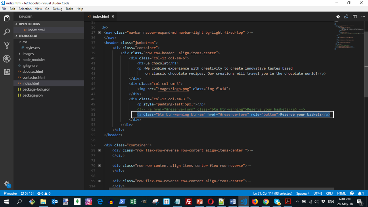
We will update the <a> tag for the button as follows:
<a type="button" class="btn btn-warning btn-sm btn-block"
  data-toggle="tooltip" data-html="true"
  title="Or Call us at <br><strong>+ 987 6543 2100</strong>"
  data-placement="bottom" href="#reserve-form">
  Reserve your baskets
</a>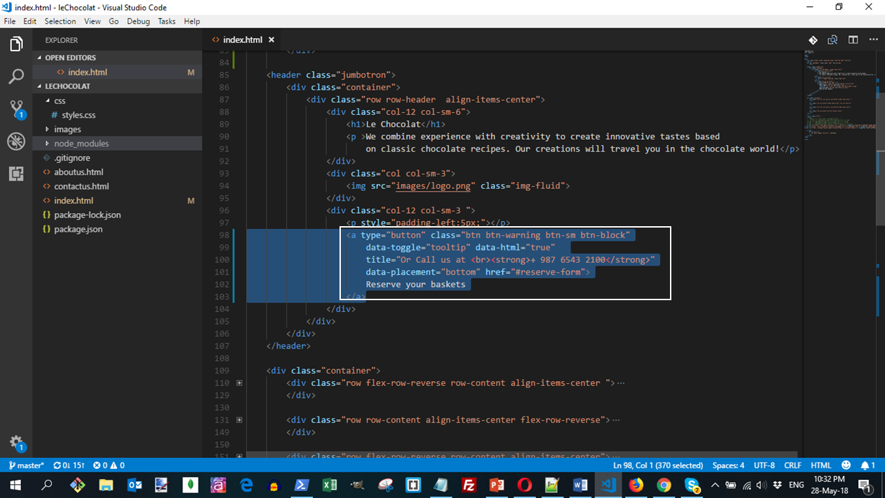
As you can see from the code, we add a data-toggle, data-placement and a title attribute to the <a> tag in order to introduce a tooltip.
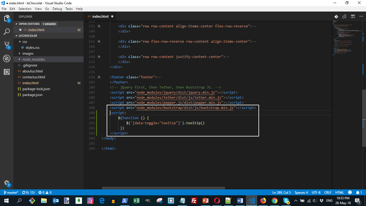
The tooltip needs to be activated by adding a small Javascript code to the bottom of the page as follows:
<script>
  $(function () {
     $('[data-toggle="tooltip"]').tooltip()
   })
 </script>
This script is added right after the line that imports the bootstrap.min.js file.
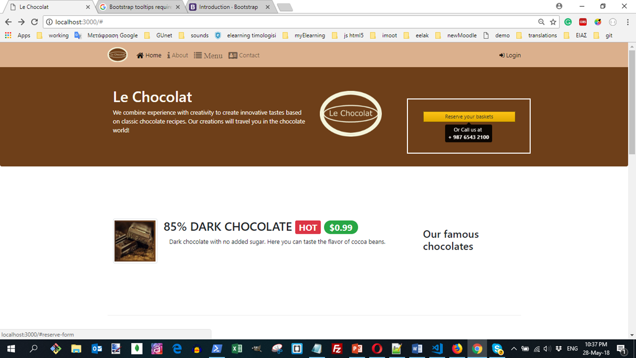
This code will create a page displayed as:
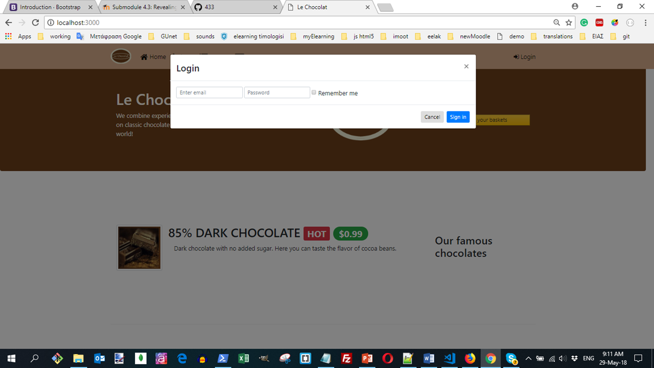
Adding a Modal
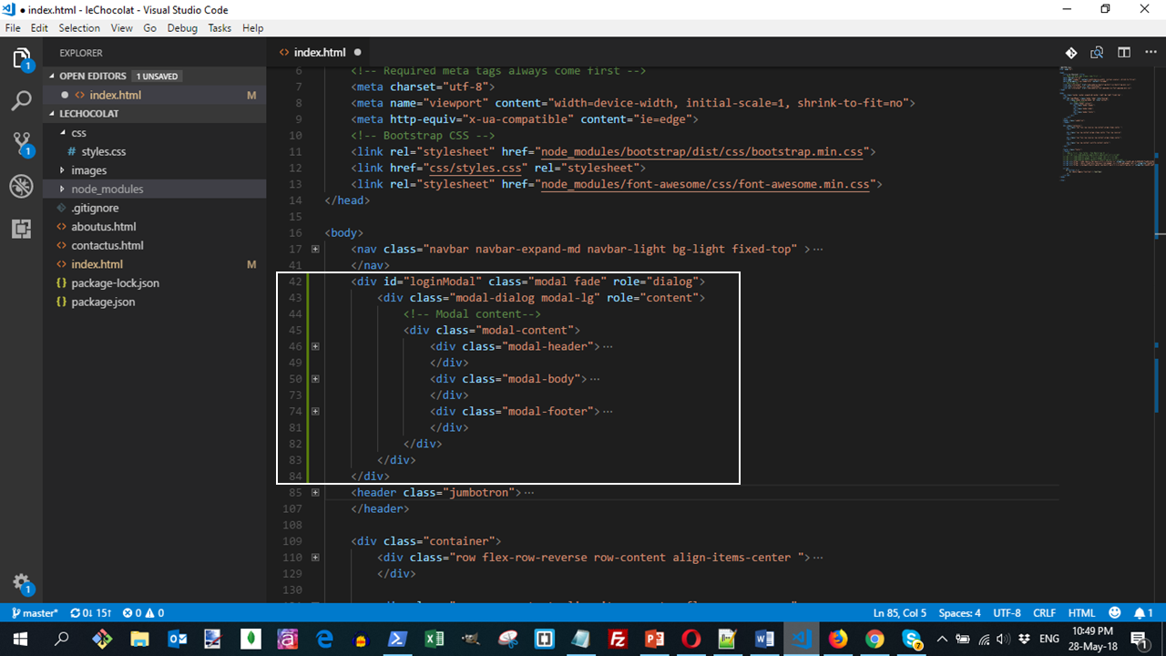
In the next step we introduce the modal to the web page. To set up the modal, add the following code right after the navbar at the top of the page.
Next, we introduce another link on the right side of the navbar in order to trigger the display of the modal. To do this, add the following code in the navbar after the </ul>
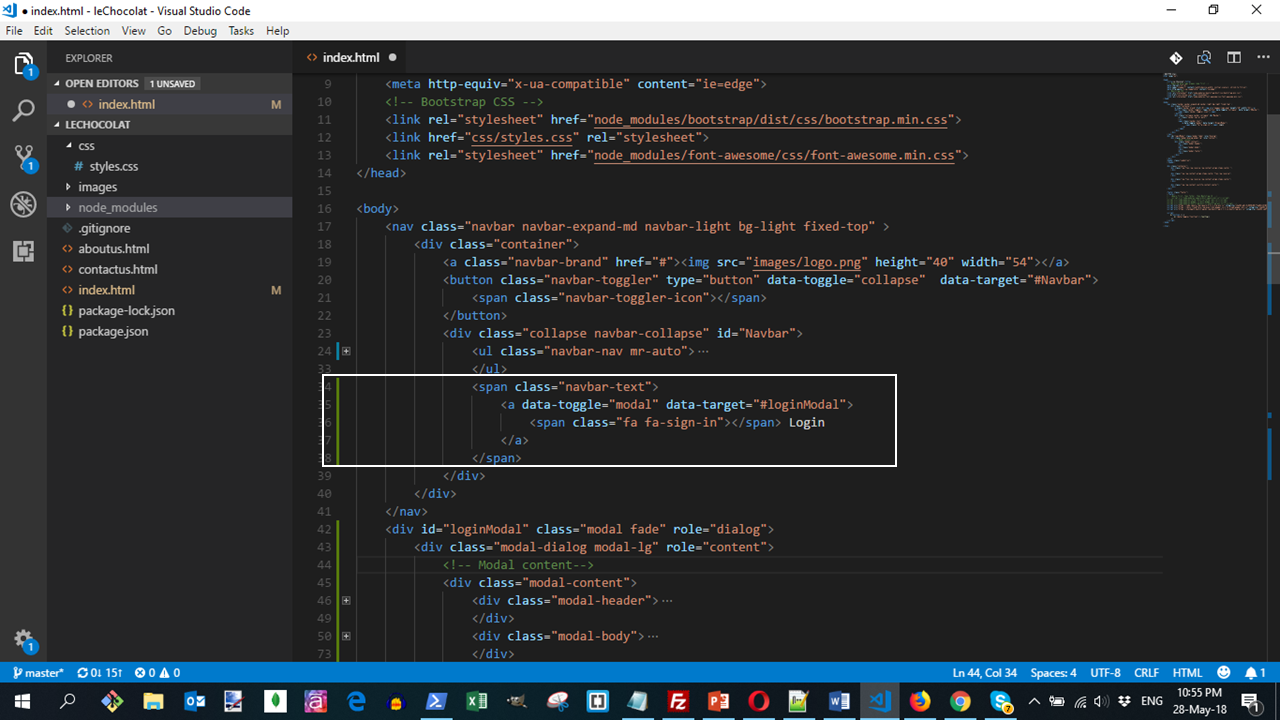
<span class="navbar-text">
  <a data-toggle="modal" data-target="#loginModal">
     <span class="fa fa-sign-in"></span> Login
   </a>
 </span>
In addition, add the mr-auto class to the <ul> in the navbar as follows:
<ul class="navbar-nav mr-auto">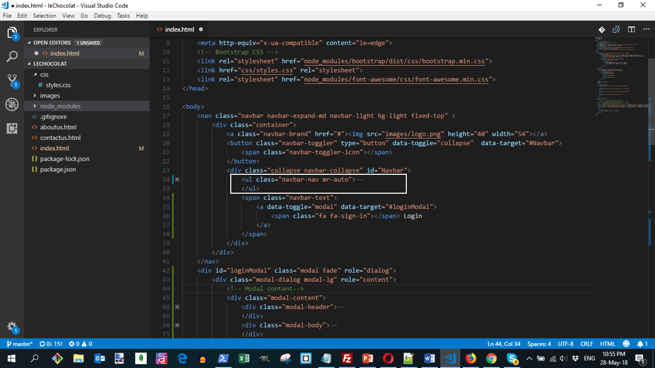
We are introducing another link to the right of the navbar using the navbar-text and using the mr-auto class to the <ul>. This contains a link with an <a> tag with the data-toggle="modal" and data-target="#loginModal" attributes.
This code will create a page displayed as:
Do a Git commit
Do a Git commit with the message "Tooltip and Modal".
In this submodule, we explored tooltips and modals as two ways of revealing content for the user upon clicking on a button or a link.