Submodule 4.1: Navigation - Icons
Submodule 4.1: Navigation - Icons
- Navigation
- Navigation bars
- Breadcrumbs
- Font Awesome
Create a basic navigation bar
Creating a responsive navigation bar
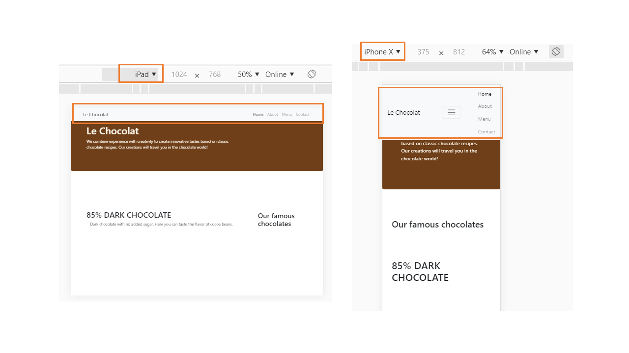
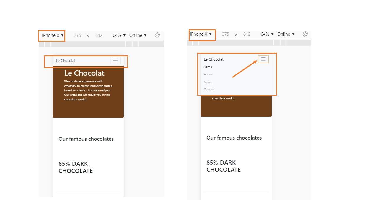
We would like the navigation bar elements to collapse for shorter screens, to be replaced by a toggle button so that the items can be toggled on or off when required on small and extra small screens.
This can be achieved by adding the following code to the navigation bar, inside the container div just below the <a>...</a> tag and above the ul.
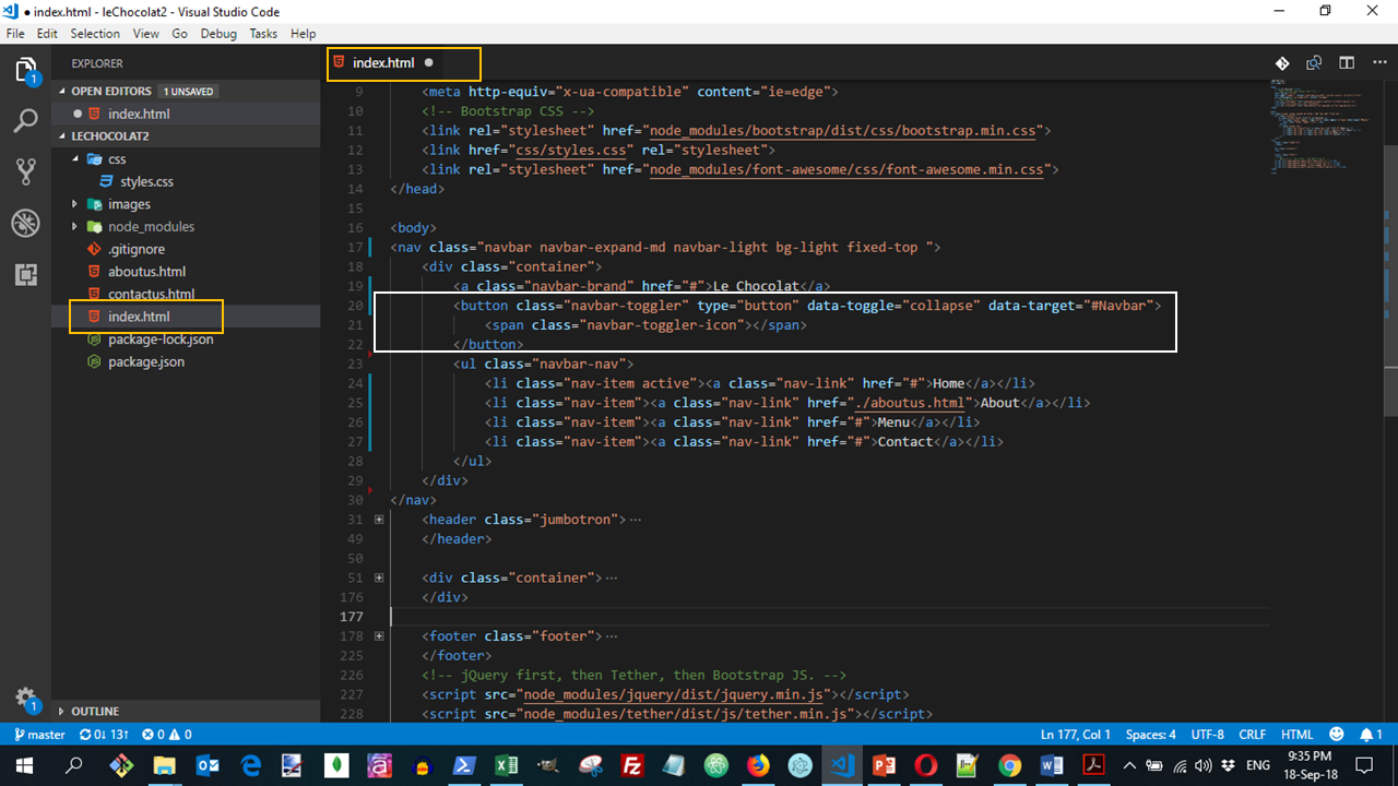
This creates a button with three horizontal lines. For medium to extra large screens, this button is hidden. For small and extra small screens, this button becomes visible. This button will act as the toggle for the navbar items.
To hide the items from the navigation bar for the small screens, we need to enclose the ul within another div as follows:
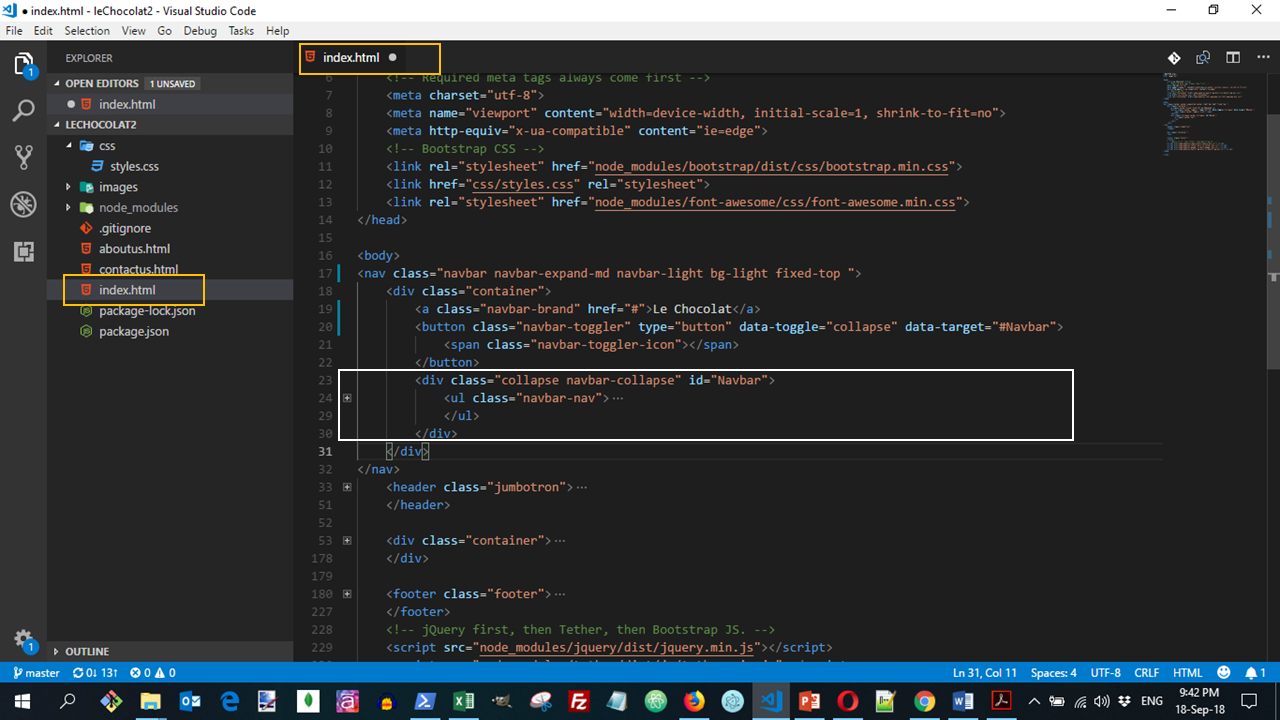
By doing this, we are specifying that this div with collapse and navbar-collapse classes and with the id Navbar will be collapsed on small and xs screens, but can be toggled on or off when the toggle button is clicked.
Note the use of
data-toggle="collapse" data-target="#Navbar"within the button above. This specifies that the menu items are collapsed on small and xs screens when the toggle button is visible. They can be displayed or hidden by clicking the toggle button.
The above code will create a page displayed as:
You can see all the needed code for this lesson:
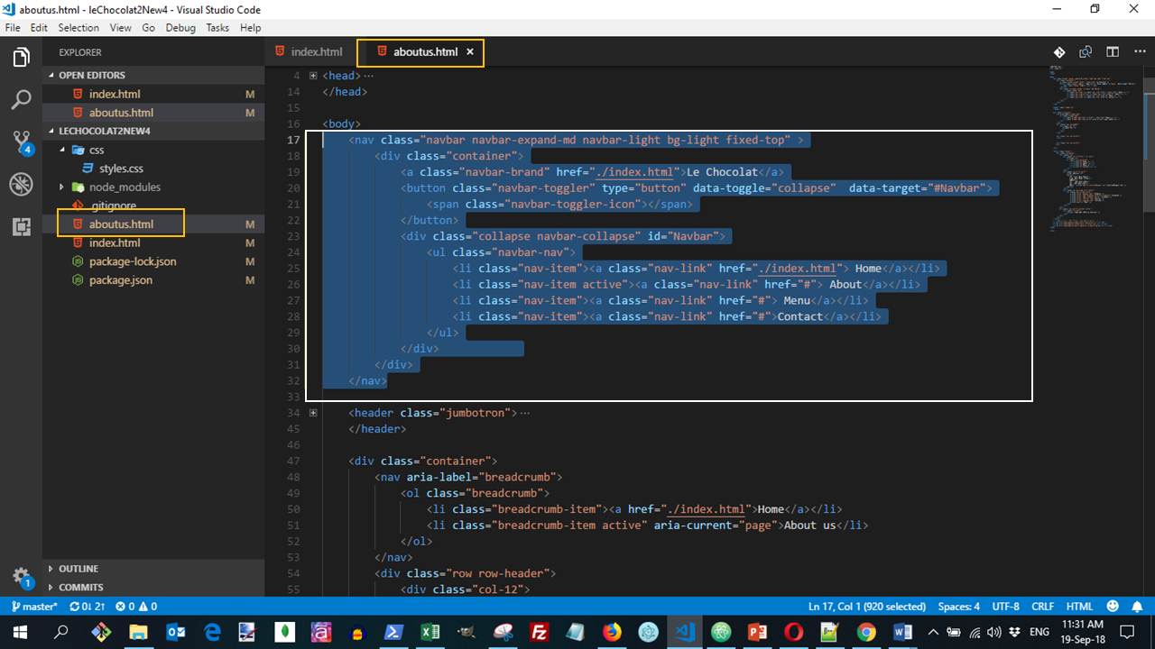
Copy and paste the entire navbar code also into aboutus.html to add the navigation also to that page.
- Make sure to change the <li> corresponding to "About" to active, and remove the active class from the Home link.
- Also, update the home link to take you back to index.html.
- Update the navbar-brand tag also to take you back to index.html.
See more about navigation Bars in Bootstrap